Elkie.ai helps teams integrate AI into their day-to-day work. The brand needed to balance two things: technical credibility and human accessibility. It had to feel structured and intelligent, without becoming cold or overly complex.
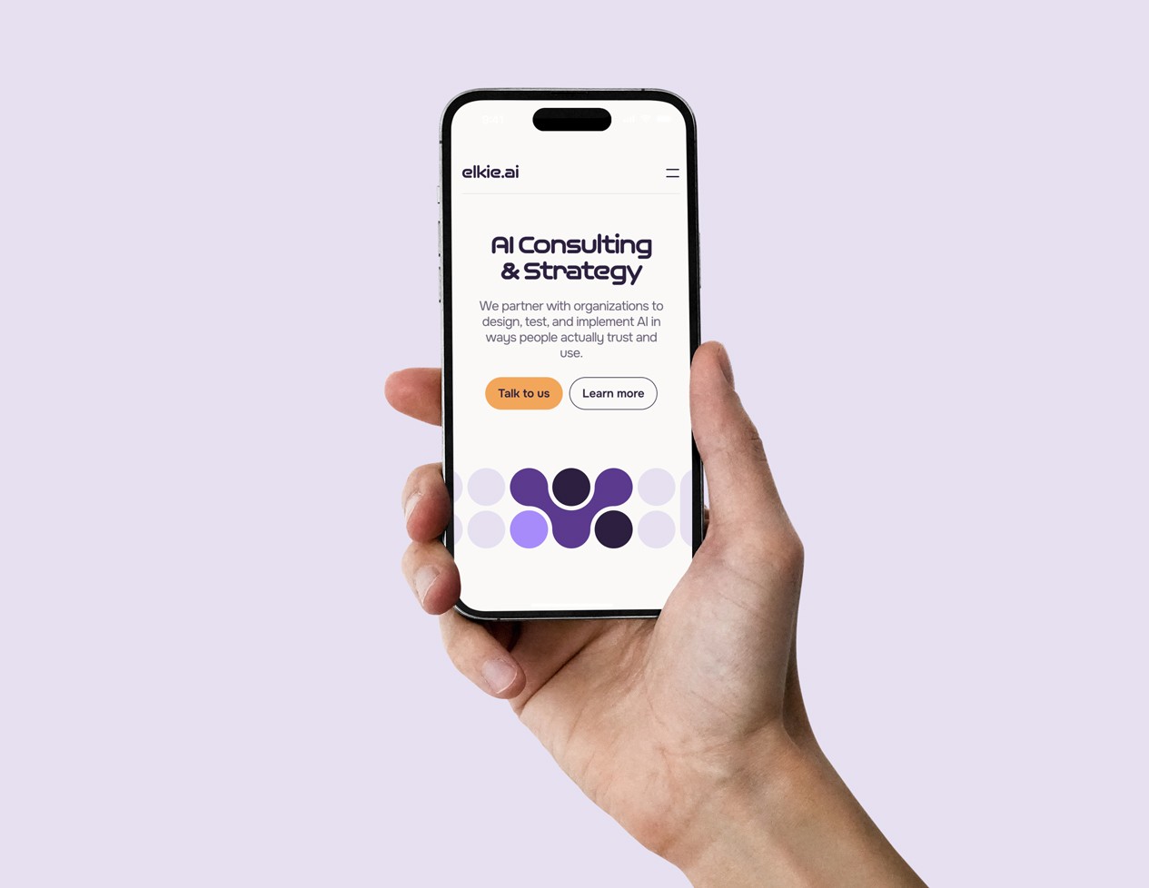
The identity had to work across multiple touchpoints, from product and training to communication and marketing, while staying consistent throughout.
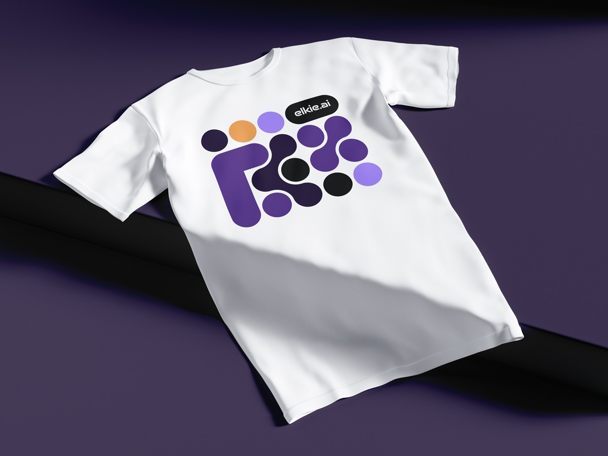
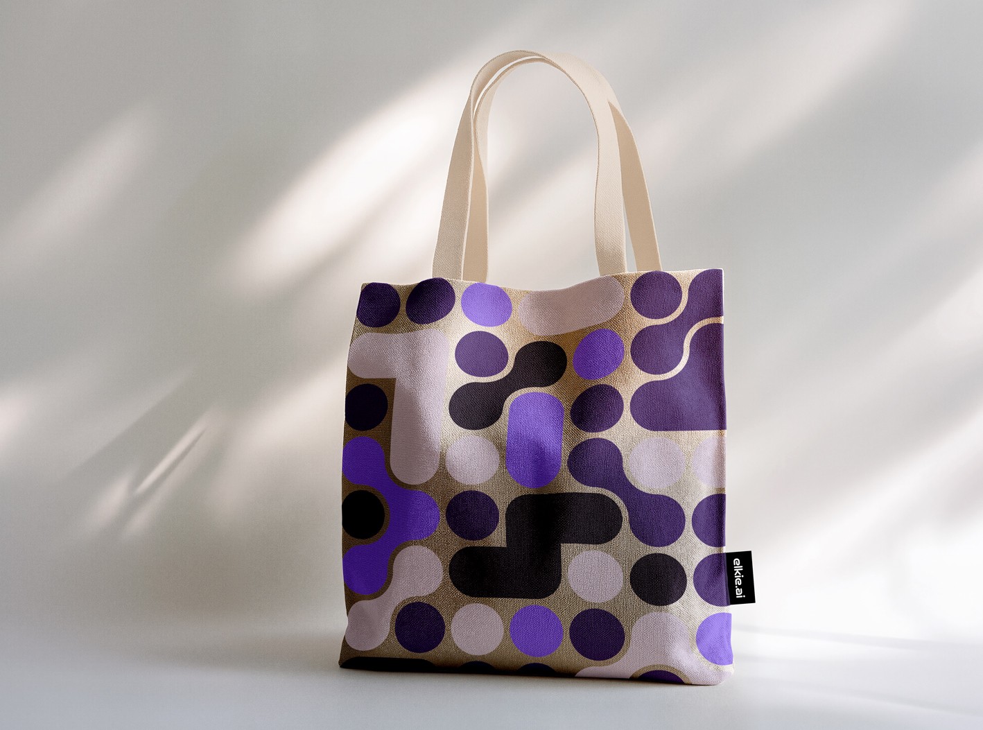
The concept was built around connection and structure.
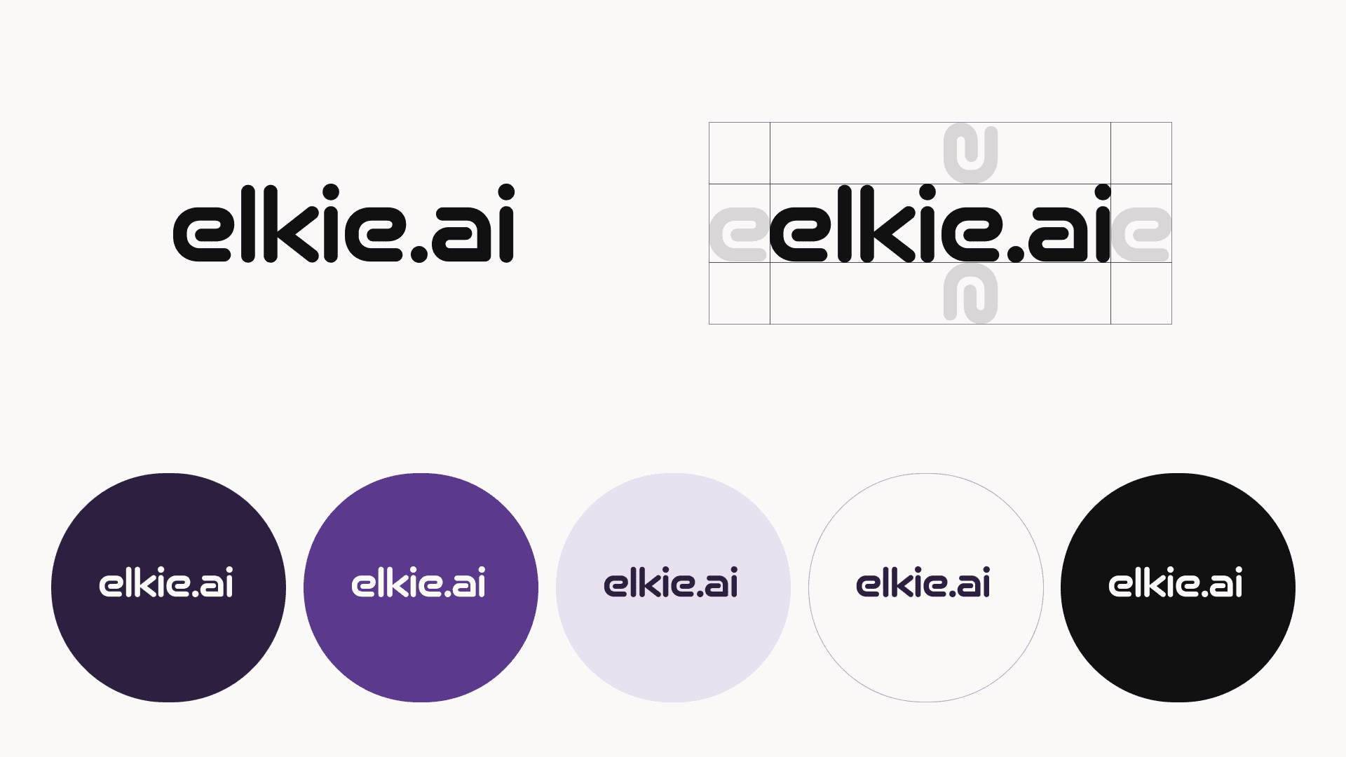
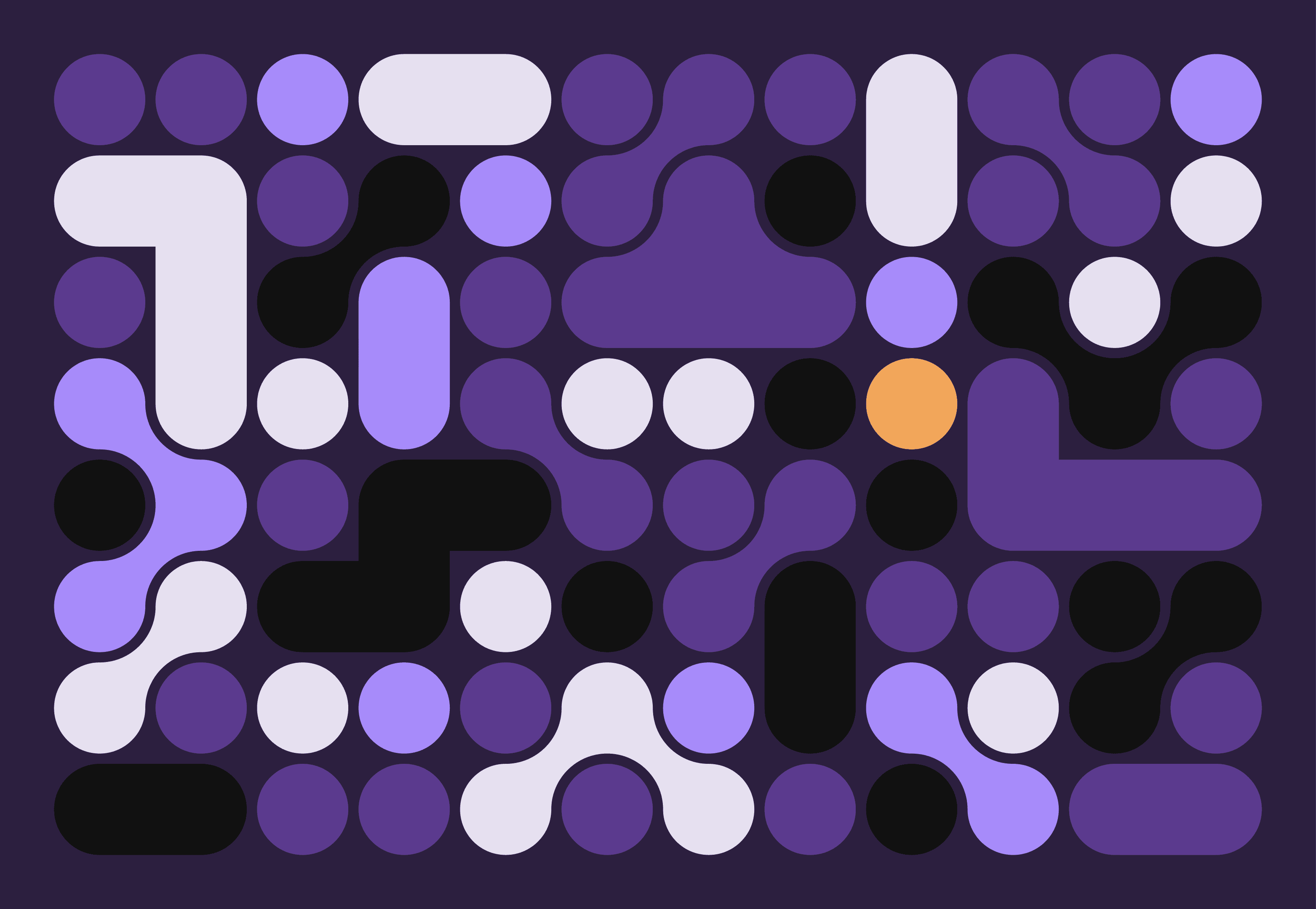
A modular visual system inspired by networks became the foundation. Simple circular shapes expand and link together, forming a flexible grid that can grow and adapt. This reflects how elkie.ai works: connecting tools, teams, and workflows into something more efficient.
The color palette balances depth and clarity. Dark purples create a sense of confidence and reliability, while lighter tones and accents introduce space, focus, and energy.
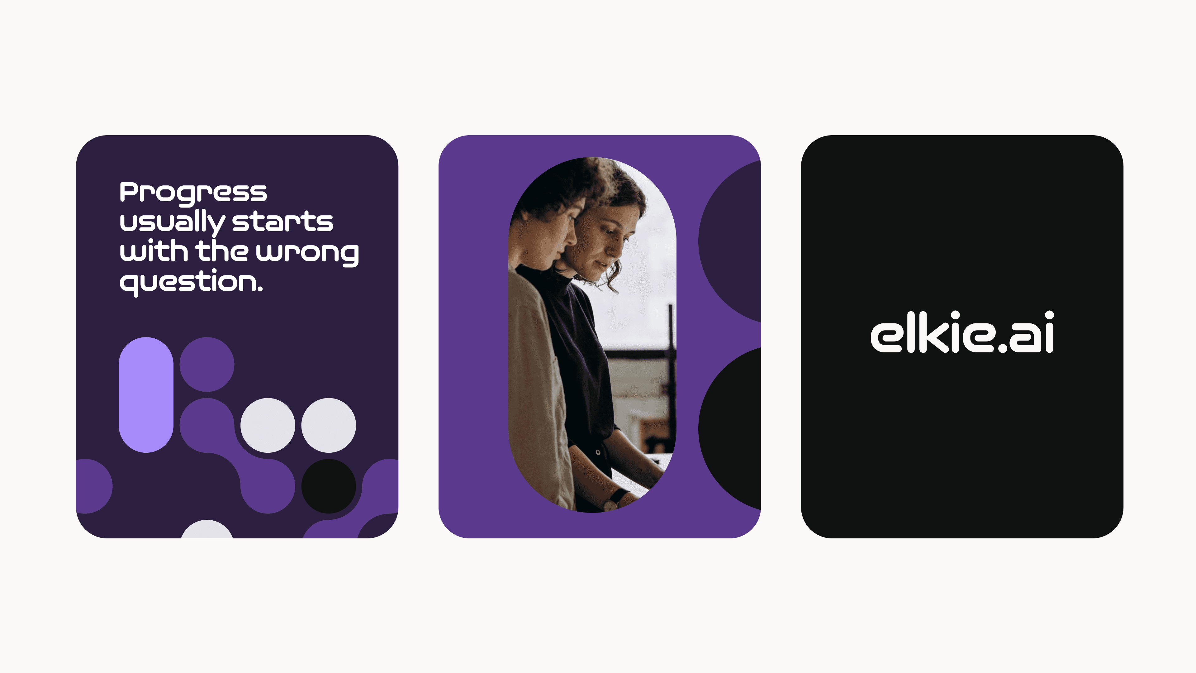
Photography brings in the human layer. Real people, real interactions, and real work moments, keeping the brand grounded and relatable.

The result is a system that feels both structured and alive.
A clear visual language that scales across digital and brand applications. A modular toolkit that allows for flexibility without losing consistency. And a tone that makes AI feel approachable, without oversimplifying it.
A brand designed to support how elkie.ai operates: practical, collaborative, and focused on making AI actually work.
Credits
Animation by Irka Birka